Most game developers do all they can to make their in-app purchases as enticing as possible. Whether it’s faster resources, more chapters, or powerful items, the cash shop should serve to make the game even more fun and addicting than it already is.
However, many indie and mobile developers make the same mistake of not putting more effort into how the in-app purchases are presented. This is understandable since devs want to make their gameplay as perfect as possible, but it will all be a waste if you can’t get anyone to consider tossing a few bucks your way.
The following area a number of user interface decisions some of the top grossing games have made. If you want to have success with your own free-to-play game, it wouldn’t hurt to see what the popular games are doing.
1. Make Sure The Menus Are Easily Accessible
After all the work you put into making a great game, it’d be a shame if players didn’t buy something from your cash shop simply because they didn’t know how. Guarantee that your UI is designed so that players can navigate the menus and clearly locate your in-app purchase screen.
A good idea is to ask people who are playtesting your game to try and perform an in-app purchase. As we’ve covered in other pieces, playtesters can provide valuable information to help you make a game for players and not just you. If your playtesters struggle to find the in-app purchase screen or take a long time to figure it out, it’s time to make some changes.
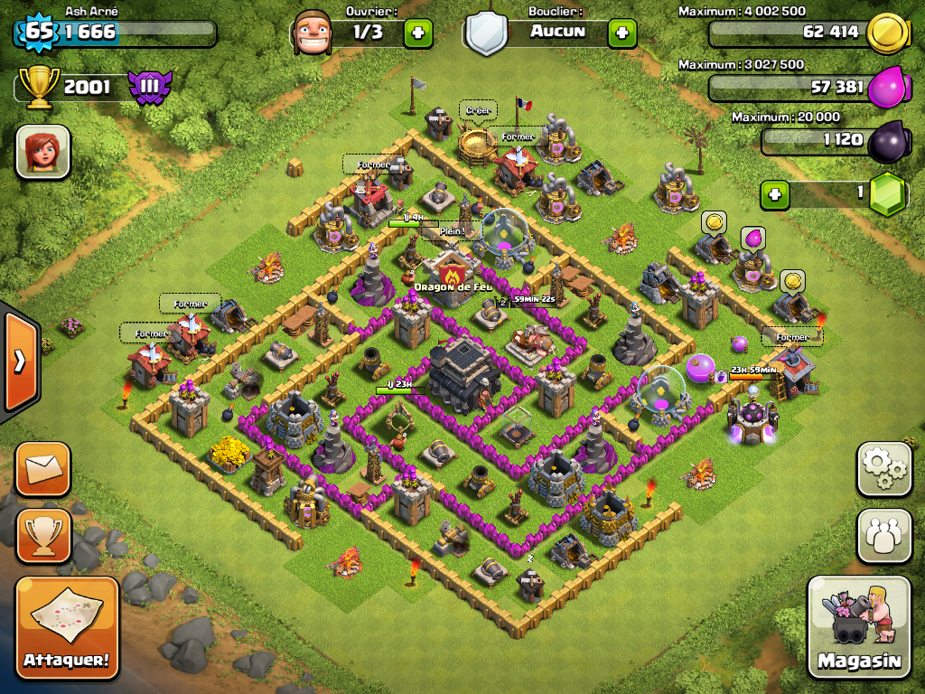
It is also wise to consider how many taps it takes for someone to complete a purchase. Clash of Clans is a good example as it only takes two icon presses from their main screen (Shop, then Treasure) to check out their gems page. Do whatever it takes to get that number down to less than three taps.
2. Make Buttons And Menus More Attractive
It’s doesn’t take a UI expert to know that people are attracted to bright colors and lights. Casinos have been doing this for years with gambling games that bombard passer-byers with glowing lights, bright UI screens, and even attractive sounds. This also why many successful games employ brighter areas and animated effects to increase the chance of players looking at the promotion being offered.
One trick that UI designers use is doing what’s called the blur test. This involves squinting your eyes to see what UI elements are still clear and readable. The goal is to increase the contrast on the button promoting your cash shop so that it’s brighter than the rest of the screen and thus more attention-grabbing.
While most would argue that this is getting too pushy, a full screen promotion can also be very effective.Instead of annoying players by having it pop up after every stage or level, only use full screen promotions when you’re doing a special sale.

3. Use Visuals and Language That Are Familiar
For many developers there’s a lot of pride in making your game feel completely unique. While innovation and creativity are more than welcome when it comes to gameplay, players may be more inclined to press that purchase button if it looks familiar to them. That is why many of the top-grossing games currently on the App Store and other mobile platforms all share a few similarities when it comes to their UI.
For example, have you ever noticed how a lot of games use a “+” symbol to indicate that the button will take you to the in-app store? You can probably assume that your players have also played top games like Clash of Clans or Candy Crush, which both use the “+” symbol. By doing the same you can avoid confusion while also adding a touch of familiarity as well.
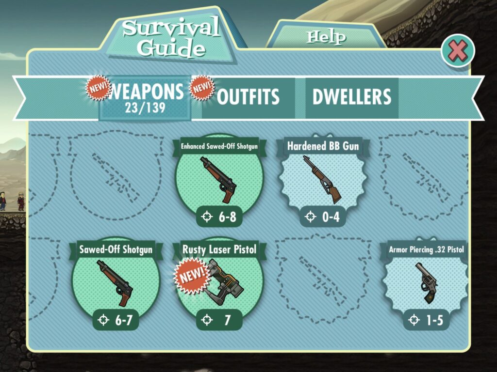
Also common is the use of badge icons to direct attention to the offer you think is the best and most attractive one. Make sure to add phrases like “New!,” “25% Off!,” or “Best Deal!” so players know why that particular item or bundle is worth picking up at that very moment. Don’t forget to also design the badges/icons so they contrast with the rest of the screen and stand out.
[su_note]Learn the skills you need to succeed as a game designer at the Game Design School at the New York Film Academy by clicking here.[/su_note]
