Like in life, learning the hard way is never a pleasant experience. Instead of identifying your game design mistake beforehand and avoiding it, you get hit by it extra hard when players ask how something so terrible could be in your product. Although even the best and most experienced designers have launched a title with decisions they later regret, only a fool doesn’t study other games to see what mistakes they can avoid in their own.
We’ve talked about five common mistakes before, and then we went over five more. The following are five additional design choices that leave a bad taste in the player’s mouth and are way more common than they should be.
1. Bad Save Point Placement
Anyone who played games in the late 80s and early 90s—before save points were commonplace—knows that automatic save points are a good thing. There was nothing worse than playing for hours or defeating a tough boss, only to die and lose it all because you forgot to save. Our beef is with save points that seem to be placed just to frustrate the player.
For example, we’ve all played a game where a save point happens just before a difficult boss. The problem is that prior to the boss fight we have to watch a long cut scene that can’t be skipped, which means you’ll probably be forced to watch it a few times. Even though they’re also very proud of the cool cut scene in their game, good designers will have the decency to place the save point after it so you can jump back into the fight after every defeat.
2. Bosses with Insane Health
A good boss battle is the result of careful and lengthy design, testing, and iteration by the developer. All of our favorites were designed to give us a challenging yet rewarding experience that made the trek through the dungeon worthwhile. Unfortunately, we’ve also faced an annoying boss that felt more like a chore than an epic encounter.
One way to bore players with your bosses is by making them a “bullet sponge”. These bosses take a ridiculous amount of damage before finally dying, which often involves the repetitive act of shooting/attacking its weak point for a very long time. A good example is the final showdown with the boss, Shao Khan,in Mortal Kombat 9. Defeating him is a boringly repetitive chore of Down, Left, Square over and over until he is dead. Unless the boss changes tactics often and keeps this fresh, it’s better to avoid designing bosses that take several minutes of doing the same thing over and over.
3. Psychic A.I. Enemies
We’ve all been there. You see a group of enemies and creep near them, waiting until one separates from the group. Once it is safe to do so, you take the lone enemy out far enough away so that no other enemy notices. But instead, all the other enemies in the room magically know what you did and start charging straight at you.
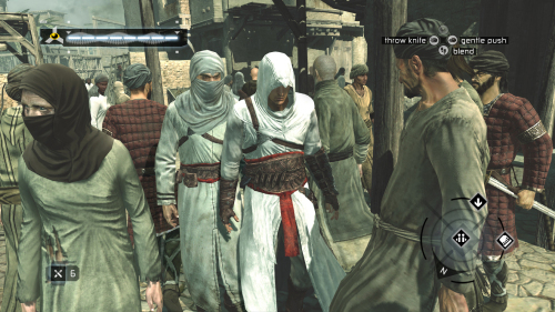
Or worse, they find you no matter where you hide and can shoot you even though they’re on the other side of the room. An example of a game suffers in this regard is Assassins Creed Rogue. Specifically, the Aggro distance (meaning the cone of awareness around an enemy AI within which a player’s actions trigger the enemy to attack the player) is overly long and sensitive. In particular the vertical view distance and cone of vision of enemy Snipers are unrealistically large. As a result it feels like Paris is on hair trigger alert to attack the player. It feels like the enemy AI have eyes in the back of their heads. The end result is a frustrating play experience that does not allow the player to use stealth mechanics to her satisfaction. What’s the solution? Tweak and test the numbers for the enemy view distance to allow the player more satisfying stealth play. This issue is becoming less common thanks to improvements in technology, but it still happens. Instead of engrossing players into the stealth gameplay, they are taken out of it when enemies unrealistically seem to possess psychic abilities.
4. Escort Missions with Dumb NPCs
Escort missions aren’t the most common type of quests/objectives but they can be tremendously fun when done right. Players get frustrated with escort missions when the NCPs that the player must work with test the player’s patience. We’re talking about the ones that never seem to move at an appropriate speed.

Nothing tests your patience more than an escort NPC that walks at a mind-numbingly slow pace. The destination is already in site, but if you run too far away from the NPC, you’ll fail the mission. So instead you have to walk alongside the snail of an NPC as he or she delivers some kind of monologue. This is even more annoying when you’re being attacked by enemies, which means you always have to babysit the NPC in case they fall behind or run ahead into a pack of enemies. A game that famously frustrates players in this regard is Resident Evil 4 wherein you have to save the President’s daughter, Ashley. Ashley is given to cowering when she should run thereby requiring you to expose yourself more than you would like.
5. Unbelievable Map Barriers
Designing 3D levels that both feel expansive and look believable is no easy matter. But the good news is that developers are relying less on invisible barriers that jar you when you run into one unexpectedly. The bad news is that a lot of the obstacles they place restrict players from moving outside the map are just as unbelievable.
A good example is a waist-high fence or wall in a game where your character is able to jump 10 feet into the air. You can hop over that fence/wall anywhere else on the map, but now it’s being used to indicate where the map ends. Even though we get it, it would still be nice to have a wall that is obviously unreachable despite the character’s jumping abilities.
[su_note]Click here to learn more about The School of Game Design at the New York Film Academy.[/su_note]
